You know that feeling when you do a lot of research, and after you publish your results, you notice something else that should be included as well? Happens to me all the time. Immediately after creating the list of the most outstanding blogs, I noticed a few others that should be added to the directory. Shit happens. I also tried to identify the funky new UI elements these blogs use, which would help me understand the user experience requirements driving modern publishing trends. Felt pretty good about the conclusions, but only to find myself out of luck again. Turns out I missed something very important, something I noticed when I saw what Pitchfork does with their cover articles.
When I was doing some research on Daft Punk, I read an article on Pitchfork, and their use of parallax scrolling almost brought tears to my eyes. Not that parallax scrolling is anything new - there are many outstanding cases of using this technique in web design. But usually, this means the whole website is a single-page showcase that is using multiple layers that scroll with different velocity and in different directions to display information in an interesting way. One page.
Not on Pitchfork. They're using advanced layouts and super-fancy parallax scrolling on all of their cover articles. Custom fucking everything. Contrary to some other magazines, who are also using generic parallax scrolling in their feature articles (respect!), and some other blogs using custom layouts for cover stories (respect!), this is simply over the top. Check it out for yourself. I can't imagine how much time is put into a post like this, making it looks as good as it does.
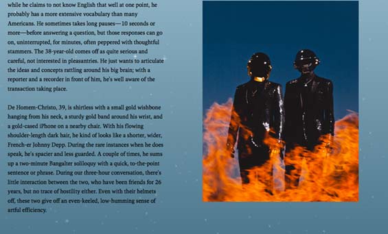


One of the crazy transitions and animations inside the story.
But what does this mean? Simple. Do you remember The Daily, an iPad-only magazine that was already discontinued? Supposedly it offered revolutionary ways of consuming content. I didn't get the chance to try it out, but I did saw a few issues of Wired on the iPad, and I have to admit, it did feel like being in the future.
These paradigms are slowly being adopted on the Web as well, and some magazines and blogs are already polishing their most important content to impressive levels, combining in-depth stories and custom development into digital masterpieces. Like Pitchfork's cover story, or even a feature on Newsweek or a review on The Verge. This goes beyond putting some text into a WYSIWYG editor and uploading a few photos. Modern (digital) publishing is obviously pointing towards a collaborative effort of a broad team of journalists, designers and web developers, which will be the only way to deliver content that will retain audience. So much for a plain and simple blog redesign.
Check out the complete Reinventing the blog series.