Fast Company
Fast Company is a great example that demonstrates the power of images - especially if you have access to professional photographic material. The home page is clean and the highlighted article is integrated into the main key visual, which works very well. The same logic of the huge picture is implemented to the inner pages as well, and this picture is transformed into a gallery if required. There isn't much of related content on a single article, and the social buttons are custom, which I think we will be seeing a lot of in the future.
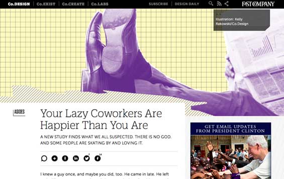
Fast Company uses an effective combination of the key visual, article header, additional flavor text and custom social buttons.
Fast Company uses custom typography, infinite scroll to avoid paging, takes good advantage from the article abstract / subtitle to make you curious (it's displayed on the article as the introduction as well), and their website is responsive. It is also interesting that they keep a single article visible above the fold on their homepage to retain focus. From the design and user experience perspective, this solution is one of my favorites.
Gawker
Gawker's innovative approach was to use two columns for news on the home page - one for top stories and one for latest stories - and ditching the main menu. While this may have been one of the most important evolutions modern blogs have made, I don't think this feature works well on the homepage, since I don't really notice the right column when I browse the site. However, this feature becomes more useful on the inner pages, where this module is duplicated, and where most people land on the site.
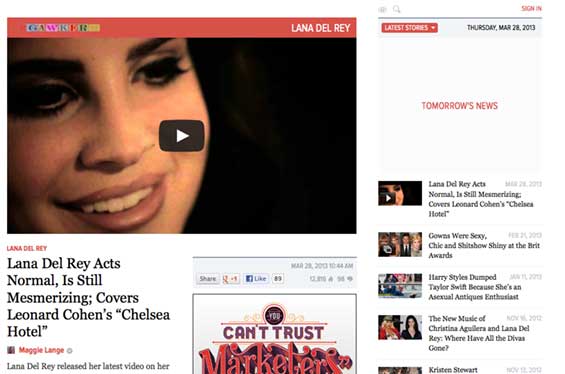
Gawker and the omnipresent main menu that changed the game.
This realization, that single blog posts should be treated as primary landing pages, is very important, and Gawker was one of the first to fully integrate that concept into its user experience. People don't browse blogs anymore, they consume social media that brings them to blogs.
Gawker also uses a big picture (not in such a cool way as Fast Company) in the post, and it's very smart and concise that this picture can be replaced with a video. I like the way comments are solved, showing only the most popular threads, and not the complete conversation (with the amount of comments they have, it would be probably useless otherwise). I'm also keen on the internal hot meter they use, which they seem to use to distinguish the top and latest news. However, they should ditch the "like Gawker" block exposed on each article, it's very misleading. The mobile site should also be replaced with a responsive version.
Mashable
Mashable's redesign introduced quite a few interesting features I look forward to adopting. They have minimized the main menu, offering a drop down popup menu that allows further classification of news. This menu is well coded and does a pretty good job of taking care of incidental mouse moves (not as good as Amazon though). The homepage uses three columns to display articles, even though I'm not fully sure how that works ("The new stuff" is probably all articles, "The next big thing" are probably highlighted by the editor, and "What's hot" by the crowd), and this feature's column header is fixed upon (infinite) scrolling. The design is, driven by their specific social media ninja audience, of course, responsive.
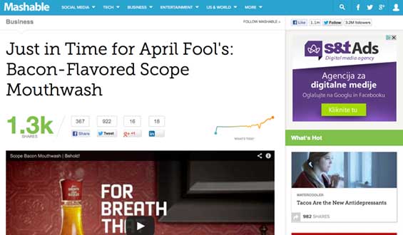
Mashable has a clever integration of social media activity on the top of the article.
What I like about Mashable's new version the most, is the clever social media integration. They have the total number of shares displayed on the top of the article, as well as a little graph that displays the dynamics of social activity for a specific post. These social media statistics are probably also used to feed the columns on the homepage, even though most people probably don't understand what's happening. But perhaps that's for the best - if it works well in recommending the articles, thumbs up.
Again, we are seeing a picture above the article, which can be video as well. That's good. What I don't like about Mashable is the three-column footer of the article, it is the same as the homepage, displaying a single category. I can understand the need for such a thing, it could work, cloning the homepage on the landing article page, but for me, it's just too overwhelming.
The Next Web
The Next Web's new design is somewhere in between Mashable and Gawker. The homepage uses two columns, the Channels, which can be configured and switched from popular to latest, and the main window, which offers a pinterest-style display of articles, similar to the one Mashable uses. This left menu box is fixed and used both on the home and inner pages, and it works as the main menu to navigate the content of the portal. The main main menu is simple and works as a hub for other TNW stuff.
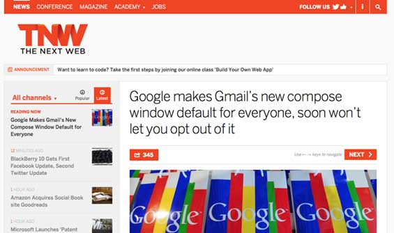
The Next Web's navigation and post header, together with instruction to use the keyboard.
The Next Web also has custom social media integration, and offers the users to navigate with the keyboard. This navigation works very well with the left box - meaning the users is navigating the current selection in the box, offering an experience similar to switching a remote on a digital TV, knowing what the next channel will be. I'm not sure how many users notice and use this feature, but this integrated content and navigation approach is very interesting.
The site is responsive, uses a big picture before the post, together with the detailed information about the article. Another interesting thing - the images break out of the paragraph form. Overall, a very solid performance with a minimalistic design.
Quartz
While Quartz may not be one of the most well-known blogs out there, it still very much deserves a mention for its creative implementation. The clever menu that collapses when you proceed to the article, the interesting fixed list on the left that can be configured and pivoted according to your wishes, making the navigation much easier and again, integrated with the content.
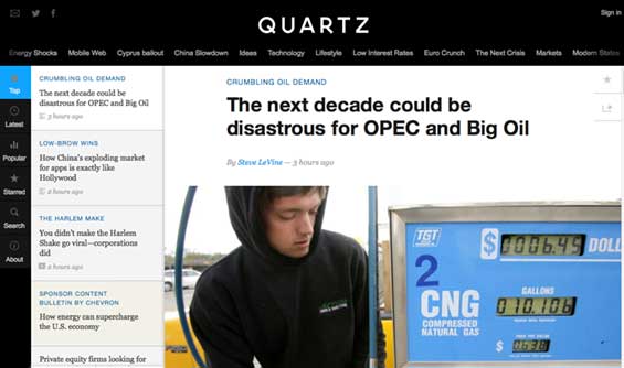
Quartz fully integrates the navigation and content.
There's another innovative feature on Quartz for which I haven't decided if I like it or not, but it is very interesting nevertheless. When you scroll to the end of the article, the next article is automatically displayed, together with a new URL. This is made as a redirect (the url changes), but it does not seem like one at all - when I get the time I will try to see how they technically achieve this. This article change is integrated with the left box, which makes the complete experience pretty interesting, similar to the one The Next Web has. What Quartz misses is better social media integration. They went a step back and decided to use links to share pages instead of widgets, which probably doesn't help their traffic that much, but it's aligned with the design. The site is responsive.
The Verge
The Verge's homepage is probably the most unique of them all. While I would make the main menu less confusing, I really like the tiles for the most interesting articles. This is followed by the video section, and by a ton of other articles - too many of them, to be honest. But things get more interesting once you get to a specific post. The menu gets smaller, there is a clear navigation to the next and previous articles at the top, and the breaking news floats.
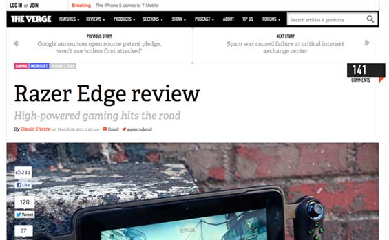
The Verge's posts are close to perfection - full of images and quotes, together with embedded galleries.
The design of the inner page is very creative, there is a huge image (not on all articles, it seems only on the reviews) with social share widgets, a secondary title is also used. I really like the quotes inside the text, and the jump-to thingie is useful as well. You can see that someone took a lot of time to shape the content, the text is wrapped around images, the galleries are embedded within the text. This gives you an impression you are browsing a high-end iPad magazine rather than a web page. There aren't to many other elements on the page, so the overall result is very clean and easy to read. On the other hand, that polished content structure probably makes it quite hard for the site to be responsive, which The Verge is not.
Wired
The legendary Wired magazine has an online edition that would make a lot of people proud. They have been always known as innovators, and were one of the first to introduce the grid display of articles instead of a list. This means the emphasis is more on the images and headings than it is on the text. The popup menu is put somewhere inside this grid of posts, which is a daring, but effective solution. This menu neatly moves to the top on the inner pages.
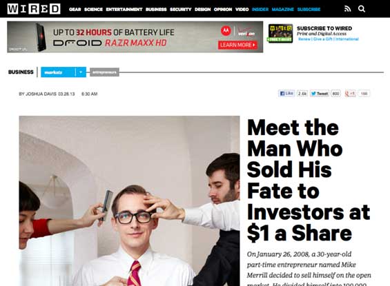
Wired's article headings have big titles and teasing abstracts.
Again, we are seeing two different types of posts as on The Verge, the basic one, and the advanced one. The advanced one is a feast to the eyes, with a huge heading and abstract that get you interested, the pictures that break out of paragraphs. But there are a few things that are not suited for such an established magazine. In a gallery, each click reloads the complete page, which can be very very annoying. I don't think hunting for ad views makes it worth it. I would also make the right column a little less overwhelming with content (not only ads, but everything else as well). And the site is not responsive.
Breaking down the elements
Based on the analysis, we can conclude that new specific elements started to emerge with the next generation of blogs. These elements are the results of us consuming content in a different way that we were a few years ago - before social and mobile. Most of them are taking care of "the homepage is not the landing page" situation, while trying to persuade people to proceed with browsing the content, lowering bounce rates.
| Fastco | Gawker | Mashable | TNW | Quartz | Verge | Wired | Total |
|---|
| Unconventional navigation | | 1 | | 1 | 1 | | | 3 |
| Fixed (floating) menu | | | 1 | 1 | 1 | | | 3 |
| Responsive design | 1 | | 1 | 1 | 1 | | | 4 |
| Big key visual before text | 1 | 1 | 1 | 1 | 1 | 1 | 1 | 7 |
| Advanced key visual (gallery, video) | 1 | 1 | 1 | | | | | 3 |
| Abstract, teaser, subheading | 1 | 1 | | | | 1 | 1 | 4 |
| Suggested content within limits | 1 | 1 | | 1 | 1 | 1 | | 5 |
| Custom social media integration | 1 | | 1 | 1 | | | | 3 |
| Polished content (wrapping, quotes) | | | 1 | | | 1 | 1 | 3 |
| Custom typography | 1 | | 1 | 1 | 1 | 1 | 1 | 6 |
| Infinite scroll | 1 | | 1 | | 1 | | | 3 |
| Pinterest-style homepage | | | 1 | 1 | | 1 | 1 | 4 |
| Integrated content and navigation | | | | 1 | 1 | | | 2 |
| Total | 8 | 5 | 9 | 9 | 8 | 6 | 5 | |
Conclusion
Typical design and user experience of mainstream blogs have evolved in the past few years, and we will be seeing similar concepts adopted by the mainstream media as well. The social and mobile era have changed the way we consume content, while heightening our expectations - most of us simply count on great experiences. Luckily, the world is full of great innovators who are not afraid to take risks and implement new creative features that will become a standard in the years to come. I'm already looking forward to how other major players will respond to the new situation.
Check out the complete Reinventing the blog series.